
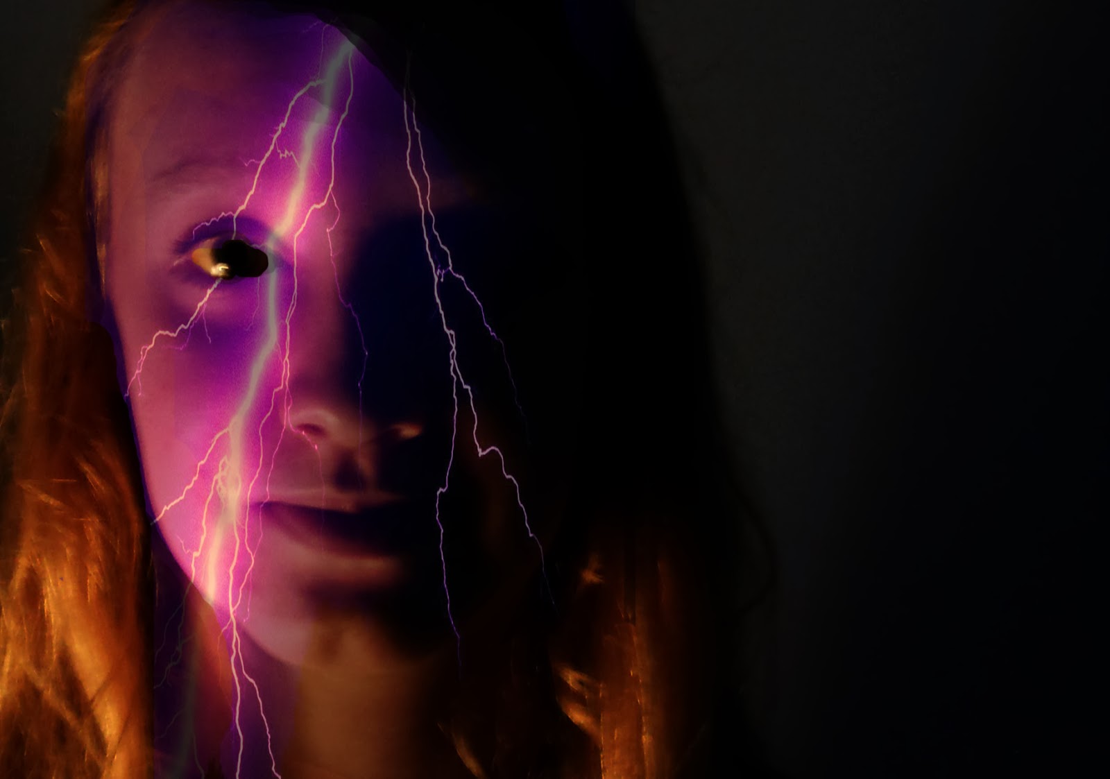
The first overlay I did was the pinkish purple lightning bolt, for this image I cropped it so that the focus was on the left side of my face. I kept the background black because it made the lighting bolt stand out more. What I would have done better is the eye, I can see that i missed a little part in the corner of my eye that didn't get erased before i saved it as a jpg.
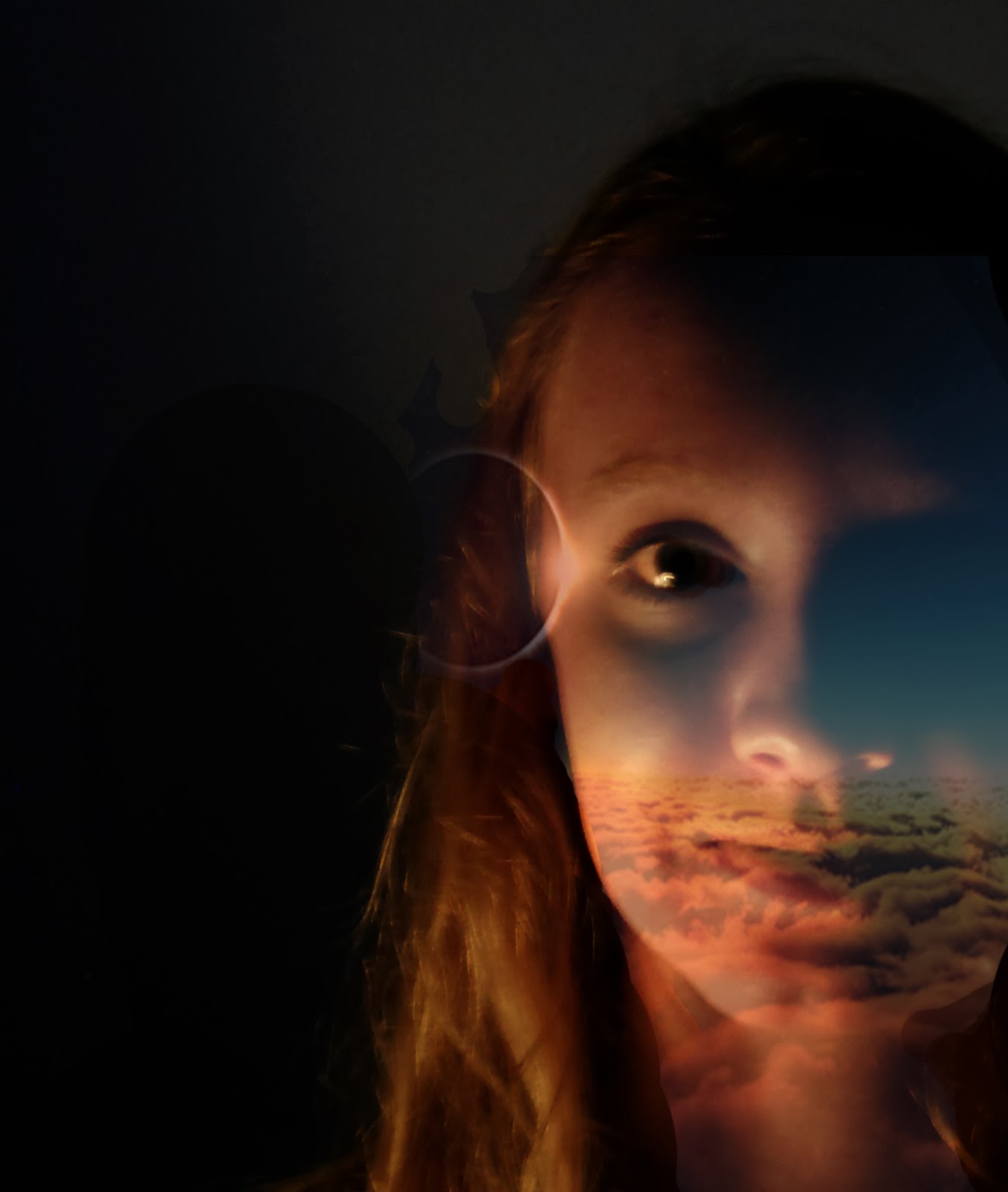
The second picture i personally think turned out a little better just because of the eye and how it fades on my neck and right side of my face to make it look like the overlay is actually a part of my face. I also didn't put a background colour or gradient because it overpowered the colours on my face. Also, before i started both of my overlay faces, I changed th elevels so that the side of my face was darker and it would look more realistic.
Hooray, a photo of your that shows good contours. You did an excellent job cropping this image. Amazing that you could get a left and right layout from the same photo. Well done!
ReplyDeleteI like how you handled the background. The darkness seems to blend smoothly into your face shadows rather than just being a flat black backdrop.
Of the two, I think I prefer the lightening bolt. I didn't notice the eye issue until you told me about it. In the second version it's not really clear to me what the texture is.
As for your reflection...arrrgh...please use capital I for the pronoun. You left a lot of detail out of your description making the task sound much easier than it was. Sometimes it helps to keep a list as your working and you'll see how much you really did to alter the image.