
Friday, 30 May 2014
VOTE Poster Assignment
Monday, 26 May 2014
Macro Photos
 |
| Isolation |
 |
| original |
This particular dandelion stood out to me because of how perfect it was. It had almost all of the white fluff left on it and it was alone in an area filled with yellow dandelions. The design concept that this photo illustrates, is texture. The white fluff is very easily identified and very close so that you can see every detail of it, but still are able to tell what it is. First of all, I cropped the picture so that the dandelion was not in the middle of the page, for the Rule of Thirds, and to get all of the other distractions out. I wanted the dandelion to really stand out and be the focal point, so I increased the saturation and contrast to make it pop.
 |
| Together Forever |
 |
| original |
These cute little flowers caught my attention because they popped out against the grass. Since these flowers look like they are meant to be together, I kept them together instead of cropping one out and getting a closer picture of one. This picture's concept shows balance, without having the focus on only one flower, the focal point in them both. I cropped the original picture a little closer to the white flowers, and decreased the saturation all the way, and I thought it made it look more interesting then the original.
 |
| Bee Happy |
 |
| original |
Thursday, 8 May 2014
Photo Restoration
| After |
 |
| Before |
 |
| After |
 |
| Before |
Now, this photo wasn't as harshly damaged as the first but had a lot of wrinkles in the background and on the older girl. For this picture I also cropped a bit of the left side out and some of the bottom where the older girl's pants were very destroyed. I changed it to black and white and clone stamped the other blemishes out. The hardest part in this picture was the line going through the girl's face and body. I tried my best to get rid of it and it was as good as I could get it.
This picture had the most damage done to it and was especially hard because of all the different patterns on the wallpaper, rug, and the little kid's outfit. Not only in the background was it badly damaged, but also in parts where lots of detail was, like on the side of the bike where the dots are and the hands and face of the child. First of all, I converted the photo to a different shade of black and white, then I cropped some wall off of the top of the picture and very little off of the bottom and right side. I used the clone stamp for the rest of the picture, paying careful attention to all of the little details. This picture took the longest time to complete.
 |
| After |
 |
| Before |
This picture had the most damage done to it and was especially hard because of all the different patterns on the wallpaper, rug, and the little kid's outfit. Not only in the background was it badly damaged, but also in parts where lots of detail was, like on the side of the bike where the dots are and the hands and face of the child. First of all, I converted the photo to a different shade of black and white, then I cropped some wall off of the top of the picture and very little off of the bottom and right side. I used the clone stamp for the rest of the picture, paying careful attention to all of the little details. This picture took the longest time to complete.
Thursday, 1 May 2014
Composite Image
 |
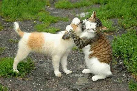
| Cats in the Big City |
The concept of this image is a futuristic, space scene with cats ruling it. The techniques I used to complete this image was finding a picture of the Toronto skyline and taking out the sky and adding a nebula into the background. At first the city was too bright in contrast to the background, so I had to change the brightness of the city to make it look more realistic. I then added the cats for the cuteness factor, so that the futuristic Toronto is more friendly looking. This contains 7 different pictures in total. After I added the cats, I thought that it was pretty silly looking but then I decided to keep them because it makes the picture funnier and more interesting.


Monday, 28 April 2014
Composite Critique
 |
| Trouble at Home |
Friday, 25 April 2014
Digital Abstract
 |
| Colour Pop |
 |
| before |
 |
| Comic Book Ready |
 |
| Intensity |
Friday, 11 April 2014
Poetry Cover
 My cover shows that poetry is like a tree. Always growing and expanding and becoming more beautiful with age. The bright red colour of the leaves are very eye catching and makes people want to see what it's all about. I chose this picture because it's a very calming picture with no distractions in it. I think that our students would like this cover because it's bright, peaceful, and eye catching. It really portrays the beauty of poetry and nature.
Subscribe to:
Comments (Atom)