
Friday, 30 May 2014
VOTE Poster Assignment
Monday, 26 May 2014
Macro Photos
 |
| Isolation |
 |
| original |
This particular dandelion stood out to me because of how perfect it was. It had almost all of the white fluff left on it and it was alone in an area filled with yellow dandelions. The design concept that this photo illustrates, is texture. The white fluff is very easily identified and very close so that you can see every detail of it, but still are able to tell what it is. First of all, I cropped the picture so that the dandelion was not in the middle of the page, for the Rule of Thirds, and to get all of the other distractions out. I wanted the dandelion to really stand out and be the focal point, so I increased the saturation and contrast to make it pop.
 |
| Together Forever |
 |
| original |
These cute little flowers caught my attention because they popped out against the grass. Since these flowers look like they are meant to be together, I kept them together instead of cropping one out and getting a closer picture of one. This picture's concept shows balance, without having the focus on only one flower, the focal point in them both. I cropped the original picture a little closer to the white flowers, and decreased the saturation all the way, and I thought it made it look more interesting then the original.
 |
| Bee Happy |
 |
| original |
Thursday, 8 May 2014
Photo Restoration
| After |
 |
| Before |
 |
| After |
 |
| Before |
Now, this photo wasn't as harshly damaged as the first but had a lot of wrinkles in the background and on the older girl. For this picture I also cropped a bit of the left side out and some of the bottom where the older girl's pants were very destroyed. I changed it to black and white and clone stamped the other blemishes out. The hardest part in this picture was the line going through the girl's face and body. I tried my best to get rid of it and it was as good as I could get it.
This picture had the most damage done to it and was especially hard because of all the different patterns on the wallpaper, rug, and the little kid's outfit. Not only in the background was it badly damaged, but also in parts where lots of detail was, like on the side of the bike where the dots are and the hands and face of the child. First of all, I converted the photo to a different shade of black and white, then I cropped some wall off of the top of the picture and very little off of the bottom and right side. I used the clone stamp for the rest of the picture, paying careful attention to all of the little details. This picture took the longest time to complete.
 |
| After |
 |
| Before |
This picture had the most damage done to it and was especially hard because of all the different patterns on the wallpaper, rug, and the little kid's outfit. Not only in the background was it badly damaged, but also in parts where lots of detail was, like on the side of the bike where the dots are and the hands and face of the child. First of all, I converted the photo to a different shade of black and white, then I cropped some wall off of the top of the picture and very little off of the bottom and right side. I used the clone stamp for the rest of the picture, paying careful attention to all of the little details. This picture took the longest time to complete.
Thursday, 1 May 2014
Composite Image
 |
| Cats in the Big City |
The concept of this image is a futuristic, space scene with cats ruling it. The techniques I used to complete this image was finding a picture of the Toronto skyline and taking out the sky and adding a nebula into the background. At first the city was too bright in contrast to the background, so I had to change the brightness of the city to make it look more realistic. I then added the cats for the cuteness factor, so that the futuristic Toronto is more friendly looking. This contains 7 different pictures in total. After I added the cats, I thought that it was pretty silly looking but then I decided to keep them because it makes the picture funnier and more interesting.


Monday, 28 April 2014
Composite Critique
 |
| Trouble at Home |
Friday, 25 April 2014
Digital Abstract
 |
| Colour Pop |
 |
| before |
 |
| Comic Book Ready |
 |
| Intensity |
Friday, 11 April 2014
Poetry Cover
 My cover shows that poetry is like a tree. Always growing and expanding and becoming more beautiful with age. The bright red colour of the leaves are very eye catching and makes people want to see what it's all about. I chose this picture because it's a very calming picture with no distractions in it. I think that our students would like this cover because it's bright, peaceful, and eye catching. It really portrays the beauty of poetry and nature.
Thursday, 10 April 2014
Multicultural Festival Poster

Friday, 4 April 2014
Group Installation Art- Flower CD Mobile
 |
Wednesday, 19 March 2014
Digital Portrait
 |
| Annoyed |
My first picture is of my next door neighbor Wesley. The emotion that this picture is portraying is annoyance.The lighting was just your average kitchen lights and the pose is very natural (just sitting at the island in his kitchen.) I used the filter "poster edges" and cropped the sides and top out a little bit to take out all of the distractions.
 |
| Before |
 |
| Mischievous |
 |
| Before |
 |
| Depressed This is my dog Logan, he was just sitting in an entrance to a room and looked very sad and depressed. For this photo, I cropped out the left side to get as many distractions out as I could. Then I made the picture black and white to add to the sadness communicated in this picture. |
Friday, 28 February 2014

Overlays

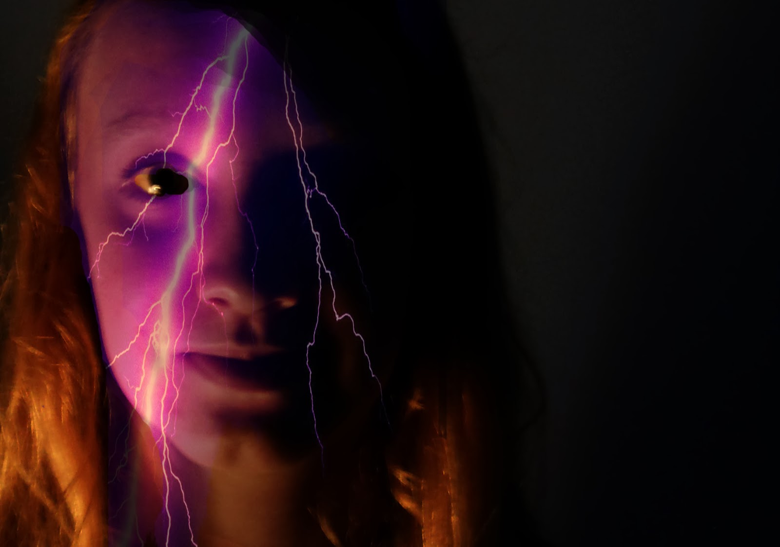
The first overlay I did was the pinkish purple lightning bolt, for this image I cropped it so that the focus was on the left side of my face. I kept the background black because it made the lighting bolt stand out more. What I would have done better is the eye, I can see that i missed a little part in the corner of my eye that didn't get erased before i saved it as a jpg.
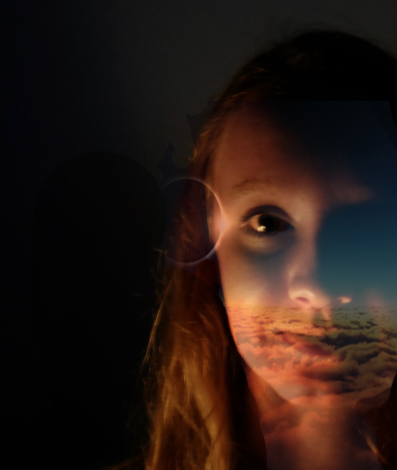
The second picture i personally think turned out a little better just because of the eye and how it fades on my neck and right side of my face to make it look like the overlay is actually a part of my face. I also didn't put a background colour or gradient because it overpowered the colours on my face. Also, before i started both of my overlay faces, I changed th elevels so that the side of my face was darker and it would look more realistic.
Monday, 24 February 2014

Thursday, 20 February 2014
Andy Warhol
 |
| Image 1 |
 |
| Image 2 |
 |
| Image 3 |
 |
| Original |
For my second picture, I wanted to do cool colours, so it would be opposite of the first picture.
Lastly, for my final Andy Warhol I decided to do secondary colours; purple, green, and orange. I wanted to do my last picture this way because my first two didn't have the same colours in them as this one does so I tried to get as many colours as I could into the last one.
Friday, 14 February 2014
Photojournalism: Wrestling Tournament
 |
| After |
 |
| Before |
This is a picture of our school's wrestling coach and another school's coach talking about the match they were currently watching. It shows that maybe wrestling is a pretty friendly sport, but only when you aren't in a match.

I chose to include this photo because of the way these two boys are positioned, right in the middle of a match trying to get the advantage. Also, the boys face that you can see is pure concentration, something that you really need to win.

This last picture shows the referee and two boys from different schools that seemed like good friends, were looking at the schedule to see if they were going to be wrestling each other.
Tuesday, 11 February 2014
Photojournalism Assignment
Staging Scenes- Staging a scene is never good for a photojournalism picture. You should not have to move an object to get a better view of it, you should move to get a better angle without disturbing the scene. You should not remove or add objects, because it makes the picture look less realistic and more staged. Altering a scene becomes unacceptable when you are attempting to copy another persons work, like in the "It All Began With a Mouse."
Manipulation of Digital Images- In photojournalism, the point is to take a picture of something that is real and shows an important message. It does not mean going on Photoshop and changing a picture so that it is no longer a real picture. You want to get people's attention with real problems and powerful pictures rather than a fake picture that looks believable.
 |
| A celebrity's invasion being intruded on by photographers. |
Friday, 7 February 2014
New Kid
In my new kid project, I combined the face of Kara, the eyes of Jamie, and the mouth of Katie. I think that the colour and shape of Jamie's eyes fit really well on Kara's face. Also I think that the mouth turned out pretty well too, but the eyes are defiantly the feature that looks he most realistic. I changed Kara's original hair colour of blonde to a brown colour that is neither too light or too dark. I feel like I could have done a better job on her hair to improve my new kid.

Subscribe to:
Comments (Atom)